The Beauty of Thunderstorms: A Color Palette to Capture the Magic
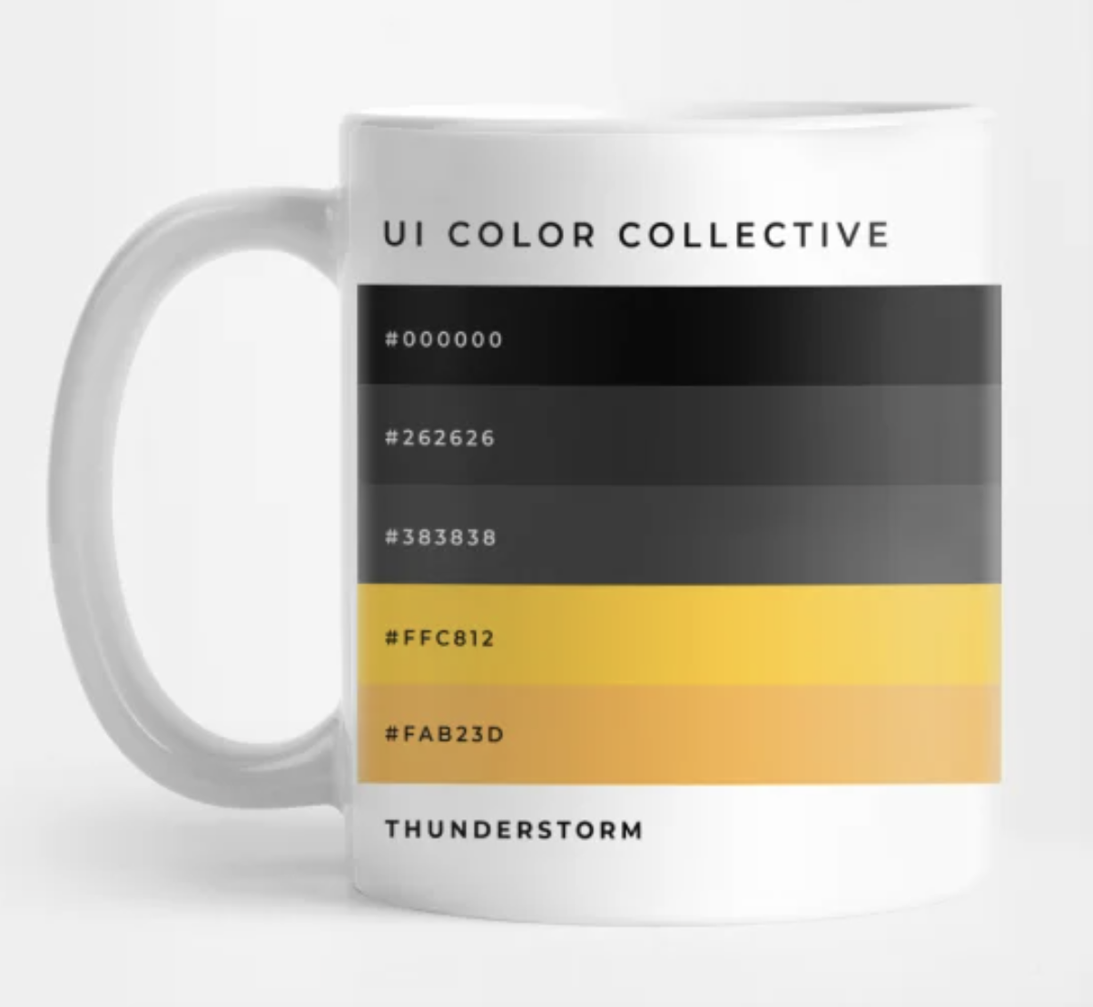
Thunderstorms are a natural phenomenon that captivates the senses, filling us with a sense of awe and wonder. The darkness, the flashes of lightning, and the roar of thunder all work together to create an unforgettable experience. If you're looking for a color palette that captures the essence of a thunderstorm, look no further than this combination of #000000, #262626, #383838, #FFC812, and #FAB23D.
At the heart of this color palette is #000000, a deep and mysterious shade of black that evokes the darkness of a thunderstorm. This color sets the tone for the rest of the palette and creates a sense of depth and contrast.
Complementing #000000 are #262626 and #383838, two shades of gray that add a sense of texture and complexity to the mix. These shades can be used to create a sense of movement and dynamism, mimicking the ever-changing nature of a thunderstorm.
For a pop of color, #FFC812 and #FAB23D are the perfect choices. These shades of yellow and gold add a sense of warmth and energy to the color palette, mimicking the flashes of lightning that illuminate the sky during a thunderstorm.
When used together, these colors create a stunning and evocative color palette that captures the magic of a thunderstorm. Whether you're designing a website, a print ad, or a social media post, this color palette can be used to create a powerful and memorable visual experience.
Incorporate these colors into your design by using #000000 as a background or as a text color to create contrast. #262626 and #383838 can be used as accent colors or to create gradients, while #FFC812 and #FAB23D can be used to draw attention to key elements or to create a sense of excitement and energy.
So, if you're looking for a color palette that captures the beauty and power of a thunderstorm, give this combination of colors a try. It's sure to create a striking and unforgettable visual experience.


Comments
Post a Comment