There's something magical about the early morning hours when the sun is just starting to rise. The sky slowly changes from dark to light, and the world begins to awaken from its slumber. It's a time of hope and renewal, and it's no wonder that so many people find inspiration in the colors of a sunrise.
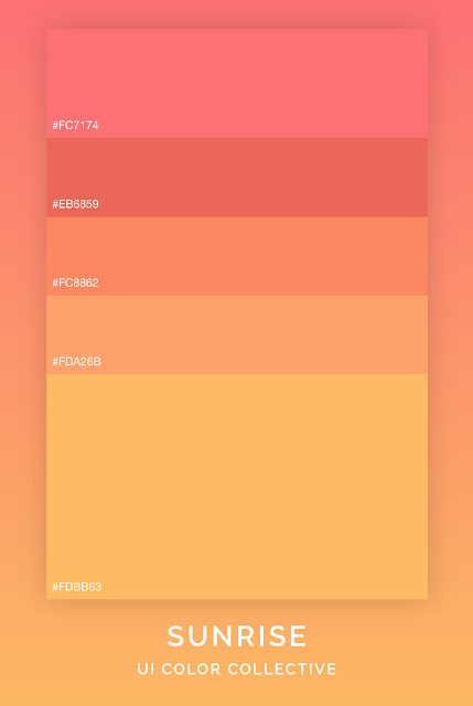
If you're looking to create a sunrise-themed color scheme, you might want to consider using shades of orange and pink. The colors #FC7174, #EB6859, #FC8862, #FDA26B, and #FDBB63 are all great options for creating a warm, inviting palette that captures the essence of a beautiful sunrise.
 |
Starting with the brightest shade, #FC7174 is a bold, eye-catching color that will instantly grab attention. It's a shade of pink that leans towards coral, and it can be used as a pop of color or as a base for your entire color scheme.
Next up is #EB6859, a slightly darker shade of pink that has a more red-orange undertone. This color can be used to add depth and contrast to your design while still maintaining the overall warmth of your color scheme.
For a slightly more muted tone, you might want to consider #FC8862. This shade of orange is still quite bright, but it has a bit more depth than the previous two colors. It's a great option for creating a more subtle gradient in your design.
Moving towards the darker end of the spectrum, we have #FDA26B. This color is a rich, burnt orange that adds a touch of warmth and sophistication to your design. It pairs well with the brighter shades in this palette and can be used as an accent color or as a main feature.
Finally, we have #FDBB63, a soft, muted shade of orange that adds a bit of calm to your color scheme. It's a great option for creating a more soothing design or for balancing out the brighter shades in your palette.
When used together, these five colors create a warm, inviting palette that captures the beauty of a sunrise. Whether you're designing a website, creating a logo, or putting together a social media post, this color scheme is sure to inspire and captivate your audience. So go ahead and let the colors of a sunrise guide your next design project!
Check out this color palette on Adobe Color for easy hexadecimal value copying or to have it embedded right into your Adobe Creative Cloud.
View on Adobe Color
SUNRISE COFFEE PALETTE MUG
If you love these colors and want them on a coffee mug please grab one from my Teepublic store!
Thank you for checking out my color scheme

Comments
Post a Comment