The color blue is often associated with calmness, tranquility, and a sense of peace. When we look up at the sky, we're often greeted with a beautiful shade of blue that can help us feel relaxed and centered. That's why a "Sky Blue" color scheme can be a perfect choice for any design project that aims to create a calming and serene atmosphere.
This color scheme features a range of blues that vary in intensity and saturation, from the deepest shade of #0455BF to the lightest hue of #74B0FF. Each shade plays a unique role in creating this soothing and calming palette.

Starting with the deepest shade, we have #0455BF, a rich and intense blue that evokes a sense of depth and mystery. This color can be used to create a sense of stability and reliability in your design.
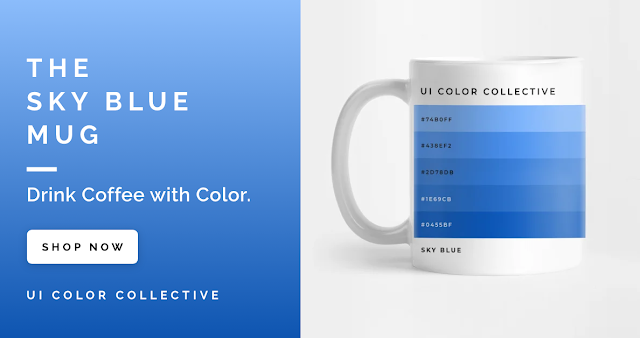
Moving on to the lighter shades, we have #1E69CB, a bright and lively shade of blue that adds a sense of energy and enthusiasm to the palette. This color can be used to create a sense of playfulness and creativity in your design.
Continuing with the mid-tones, we have #2D78DB, a cooler and more subdued shade of blue that adds a sense of calmness and tranquility to the palette. This color can be used to create a sense of serenity and peace in your design.
Next up is #438EF2, a light and airy shade of blue that adds a sense of freshness and lightness to the palette. This color can be used to create a sense of purity and clarity in your design.
Finally, we have #74B0FF, the lightest shade of blue in the palette, which evokes a sense of clarity and openness. This color can be used to create a sense of spaciousness and freedom in your design.
When used together, these five shades of blue create a "Sky Blue" color scheme that is perfect for any design project that aims to create a calming and serene atmosphere. Whether you're designing a website for a spa, creating an artwork inspired by nature, or putting together a social media post that celebrates the beauty of the sky, this color scheme is sure to create a sense of tranquility and peace in your audience.
So if you're looking to create a design that evokes a sense of calmness and serenity, consider using the "Sky Blue" color scheme. With its range of blues that vary in intensity and saturation, this palette is perfect for creating designs that are both calming and beautiful.
| Check out this color palette on Adobe Color for easy hexadecimal value copying or to have it embedded right into your Adobe Creative Cloud. |
Comments
Post a Comment