The Lighthouse color palette
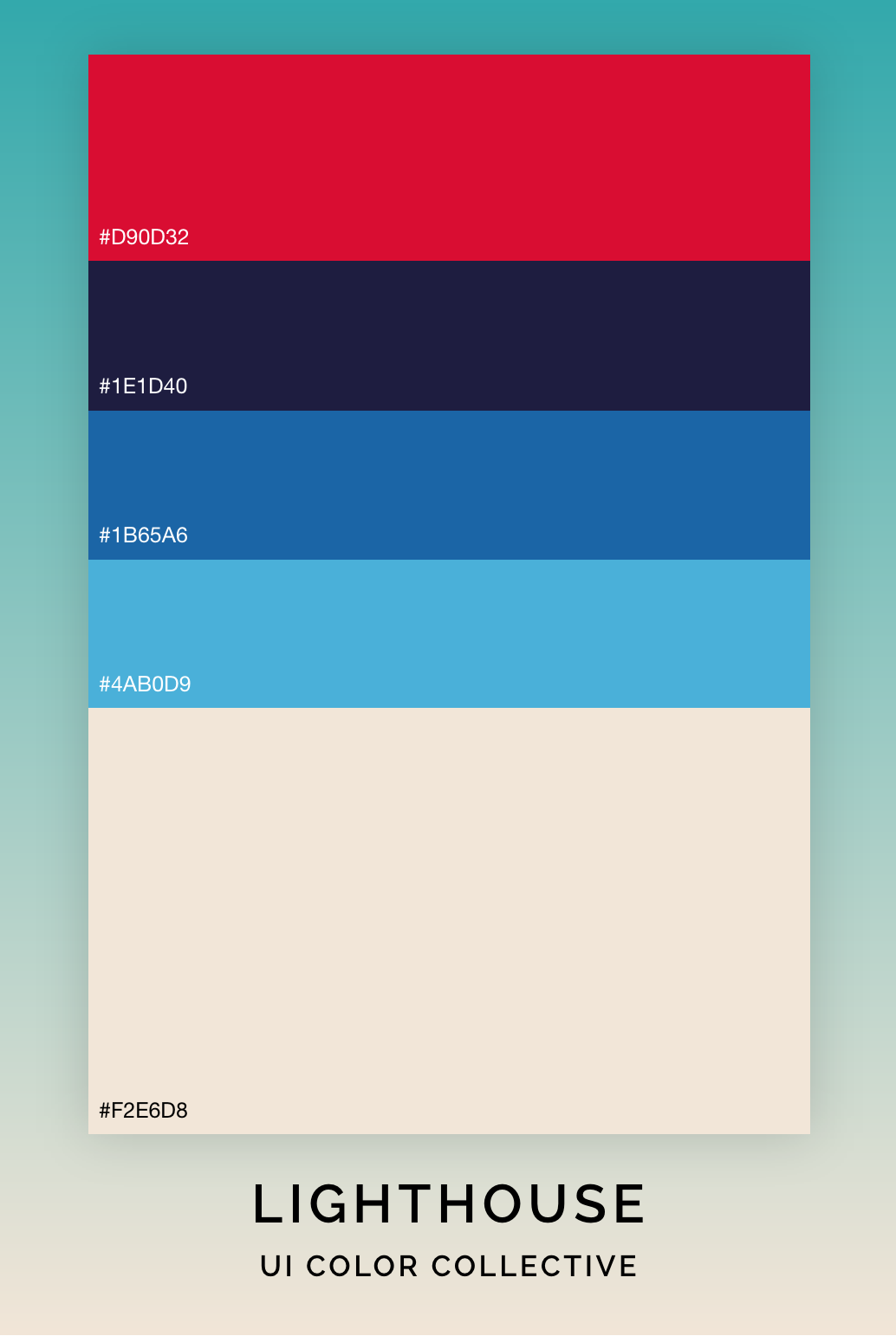
The image of a lighthouse is a classic symbol of guidance and hope, and it's no wonder that so many people find inspiration in its design. If you're looking to create a lighthouse-themed color scheme, you might want to consider using a combination of bold reds, deep blues, and warm neutrals. The colors #D90D32, #1E1D40, #1B65A6, #4AB0D9, and #F2E6D8 are all great options for creating a color scheme that captures the spirit of a lighthouse.
 |
Starting with the boldest shade, #D90D32 is a bright, vibrant red that instantly grabs attention. It's a great option for creating a pop of color or for highlighting important elements in your design.
Next up is #1E1D40, a deep, rich shade of blue that adds a sense of depth and contrast to the palette. This color can be used as a base for your design or as an accent to add a touch of drama and intrigue.
For a brighter blue that captures the essence of the sea, consider #1B65A6. This shade of blue is perfect for creating a sense of calm and serenity in your design. It can be used as a background color or as an accent to add a touch of freshness and clarity.
Moving towards the lighter end of the spectrum, we have #4AB0D9, a soft shade of blue that is reminiscent of a clear sky. This color can be used to create a sense of tranquility and harmony in your design, and it pairs beautifully with the other colors in this palette.
Finally, we have #F2E6D8, a warm, neutral shade that adds a touch of elegance and sophistication to the palette. This color can be used as a base for your design or as an accent to add a sense of warmth and comfort.
When used together, these five colors create a beautiful lighthouse-themed color scheme that captures the essence of this iconic symbol. Whether you're designing a website, creating a logo, or putting together a social media post, this color scheme is sure to inspire and captivate your audience.
So if you're looking to create a design that captures the spirit of a lighthouse, consider using these colors as your palette. With their mix of bold reds, deep blues, and warm neutrals, they are perfect for creating a sense of guidance, hope, and inspiration.
|
Check out this color palette on Adobe Color for easy hexadecimal value copying or to have it embedded right into your Adobe Creative Cloud.
Comments
Post a Comment